Friday, May 20, 2016
Wednesday, May 18, 2016
Friday, April 8, 2016
SAT Word: Aggrandize
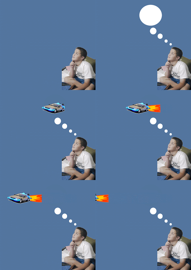
This is my animation video for the SAT word "Aggrandize". I learned quite a lot from this project. Being able to animate and create videos in photoshop is a great skill to have. I learned about the ins and outs of making transitions and such in the timeline panel. I also learned about the special format and rendering needed to start/export the project.
Thursday, April 7, 2016
Animation Poster
For this poster I created a blank 9x13 canvas. I inserted the cloud background, and then created a select border around the image. I filled the selected area with white. I then inserted text boxes and filled them with my text, positioning them as needed. I used a downloaded font "for sara" for the title/body text. I then inserted 2 separate tracings of Clark Kent and Superman that I had made. I placed each in different layers, then reduced the opacity of the top layer to have easier viewing for aligning their faces. I aligned their faces, resizing as necessary, and then cropped Clark's side in half. I then merged the layers and placed them on the edge of the cloud/white border.
Tuesday, February 16, 2016
Thursday, February 11, 2016
Text Portrait
The text I used for this project was "Still I Rise" by Maya Angelou.
I believe that no matter how many times we are burned down to ashes, we can always rise again, as Angelou said in this poem. From personal experience, rising after a fall is never easy, but it is always satisfying.
I took this poem very personally.
Thursday, January 28, 2016
Thursday, January 7, 2016
1st Semester Review
Tuesday, January 5, 2016
Adjustment Hue/Saturation
For this lesson, I created an adjustment layer, and changed the Hue/Saturation. I changed the Red, Yellow, and Blue presets to my desired levels. For the sky, I used the dropper tool under the Blue preset on the sky and adjusted the level. I then used the layer mask to remove the Hue/Saturation change on the pants and skin of the subjects.
Adjustment Filters
In this lesson I applied an adjustment layer, and then chose Photo Filter. I used a custom color (deep red) and adjusted to the red shade I liked. I then changed the intensity of the photo filter to achieve the desired effect.
Adjustment Layer Presets
Before:
After:
In this lesson, I used adjustment presets to change the colors of the images. For the first image I made an adjustment layer and used contrast level 3 preset under Levels to change the contrast. I then changed the Red Boost preset under Hue/Saturation to my preference. The Hue/Saturation preference was then saved, and applied to the second image, as well as the Levels change.
Subscribe to:
Comments (Atom)


